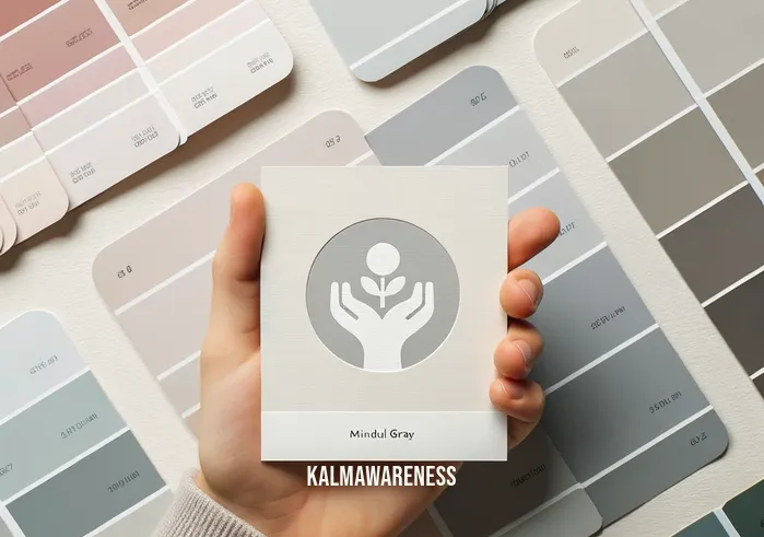
Mindful Gray Coordinating Colors: The Perfect Palette for Modern Homes
In the contemporary world of interior design and home decor, the essence of a well-curated space lies in its color scheme. Delving deep into the realm of neutral tones, the spotlight shines brightly on the versatility and elegance of mindful gray. The exquisite hue brings a sense of tranquility and sophistication, serving as a blank canvas that designers love. However, it’s not just about slapping on a coat of paint; it’s about understanding which colors harmonize with mindful gray to craft spaces that inspire. In this series, we’ll explore the wide-ranging applications of mindful gray coordinating colors and the principles behind them.
Why Neutral Tones Are Dominating Modern Homes
The magic of neutral tones lies in their ability to evoke a sense of calm and serenity. When you step into a space adorned with neutrals, you’re instantly welcomed by a soothing ambiance. This is where mindful gray makes its mark in the spectrum of neutral hues. It carries an air of modernity while holding onto the warmth and familiarity that neutrals bring.
But why are these shades reigning supreme in the design world? The answer is multifaceted:
- Versatility: Neutral tones, particularly mindful gray, effortlessly blend with varied styles – be it minimalist, bohemian, or traditional.
- Timelessness: These shades defy the constraints of fleeting trends. They’re a classic choice that stands the test of time.
- Creates a Cohesive Look: Neutrals provide a consistent backdrop, allowing decor elements to shine.
Note: Neutral tones are more than just ‘safe’ choices; they’re strategic, opening up realms of creativity and inspiration.
The Elegance of Mindful Gray
Rooted in the philosophy of mindfulness, mindful gray stands as a testament to the balance of aesthetics and emotions. It’s a shade that is neither too warm nor too cool, striking the perfect balance. When paired with the right accent colors, it can make a room feel cozier in winters and cooler in summers.
However, the key to unlocking the true potential of mindful gray lies in understanding its coordinating and complementary colors. It’s like piecing together a jigsaw puzzle; every color addition should amplify the beauty of the central hue.
Laying the Foundation with Mindful Gray
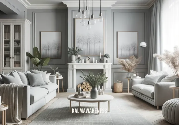
Before diving into the nuances of color coordination, it’s crucial to appreciate the base – the wall painted in mindful gray. The wall sets the tone for everything that follows, be it furniture, curtains, or decorative elements. In simpler words, the mindful space created by this hue serves as the canvas for your creative endeavors.
Moreover, mindful gray plays well with various trim colors. The best trim color for mindful gray can elevate the overall appearance of a room, providing clear boundaries and enhancing depth. This interplay of shades creates a visual treat, ensuring that the room feels open, airy, and meticulously designed.
A Sneak Peek into What Lies Ahead
Our journey into the world of mindful gray accent colors and their coordination is vast and enlightening. We will delve deep into:
- The science behind what colors go well with mindful gray
- How to strike the right balance between contrast and harmony
- Ways to infuse personality into your spaces using accent colors
By the end of this series, you’ll be armed with the knowledge and inspiration to transform your spaces into abodes of elegance, warmth, and mindfulness.
Are you ready to embark on this captivating journey into the realm of color schemes and interior design? Dive deep into the intricacies of coordinating colors with mindful gray in the next segment. Your abode awaits its transformation. Continue reading.
Unlocking the Palette: Coordinating Colors with Mindful Gray
Mindful gray, with its perfect equilibrium of cool and warm tones, presents a delightful challenge for those interested in interior design: Which colors truly capture its essence and enhance its beauty? It’s not merely about selecting any color; it’s about identifying those that harmoniously resonate with our central hue. In this chapter, we will dive deeper into the plethora of mindful gray accent colors and offer insights into creating a cohesive design narrative.
The Symphony of Coordinating Colors
Every color carries an emotion, a feel. When coordinated appropriately, these colors can either enhance or detract from the central theme. The key is understanding the nuances of each shade and how they play alongside mindful gray. By doing so, we ensure our spaces aren’t just aesthetically pleasing but emotionally resonant.
Why Coordinating Colors Matter:
- Mood Enhancement: The right color combinations can evoke specific feelings, be it calmness, vibrancy, or warmth.
- Cohesive Look: Coordinating colors tie a room together, ensuring it doesn’t feel disjointed.
- Depth and Dimension: Strategic use of accent colors can add depth and layers to a space, making it feel more dynamic.
A Guided Tour of Colors that Elevate Mindful Gray
While mindful gray is an enchanting hue on its own, pairing it with the right shades can amplify its charm exponentially. Here’s a quick list to start your journey:
- Whites and Creams: These can brighten up a space and offer a classic look.
- Deep Blues: Providing a stark contrast, deep blues can make the gray pop and infuse a room with elegance.
- Soft Pinks and Mauves: These romantic shades add warmth and a touch of whimsy.
- Earthy Browns: Grounding and robust, browns can make a space feel cozy and welcoming.
- Vibrant Greens: For those looking to add a touch of nature and vivacity.
Comparing Shades: A Quick Overview
| Color Family | Ideal for Room Types | Complements with Mindful Gray By |
|---|---|---|
| Whites/Creams | Living Rooms, Bedrooms | Brightening the space |
| Deep Blues | Studies, Libraries | Adding contrast and sophistication |
| Soft Pinks | Bedrooms, Nurseries | Introducing warmth and romance |
| Earthy Browns | Dining Rooms, Lounges | Offering a grounded feel |
| Vibrant Greens | Sunrooms, Kitchens | Infusing energy and vivacity |
By having a glance at this table, one can quickly gauge the potential each color family holds and where they fit best in the grand scheme of home decor. For those wondering what color goes well with mindful gray, this table serves as a handy guide.
Gearing up for the Next Level
With the foundational knowledge of coordinating colors in tow, we’ll soon be venturing into the practical application of these shades. How can they be used in actual spaces? What decor elements pair beautifully with these coordinated colors? Which fabrics, textures, and materials play well with this palette?
Are you curious to see mindful gray in action, intertwined with its coordinating partners, painting a picture of harmony? Continue reading. The next chapter promises a visually stimulating journey, guiding you through the myriad ways to bring these colors to life in your living spaces.

Discovering Hope in Hues: The Inspirational Journey of Mindful Gray Coordinating Colors
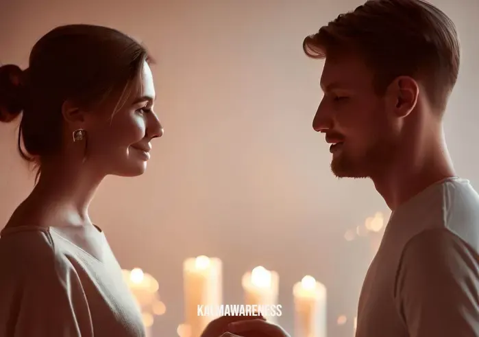
Amid the vast spectrum of colors that decorate our world, there exists a unique harmony in the palette of mindful gray coordinating colors. They not only represent modern design aesthetics but also resonate deeply with emotions, evoking feelings of hope, serenity, and inspiration. As we delve into the journey of these harmonious colors, let us explore how they’ve touched lives, transformed spaces, and illuminated countless hearts.
Colors as Catalysts for Emotion
Colors have an innate power to influence our mood, perceptions, and emotions. The coordinating colors of mindful gray, when thoughtfully paired, can elicit feelings of optimism, a sense of belonging, and a tranquil ambiance. Mindful spaces cultivated with such hues echo with tales of transformation, renewal, and hope.
“Color is a power which directly influences the soul.” – Wassily Kandinsky
This profound statement from Kandinsky beautifully encapsulates the sentiment behind choosing the right shades for our spaces. In the realm of mindful gray complementary colors, each shade weaves a narrative of positivity, balance, and hope.
Inspirational Vignettes: Real-Life Stories
Anna’s Healing Sanctuary: Anna, recovering from a tumultuous period in her life, turned to interior design as a therapeutic endeavor. Transforming her apartment, she embraced mindful gray as her primary shade. Infusing it with soft pinks and deep blues, she created a haven that not only reflected serenity but also became her space of healing and self-discovery.
Eco-Café – A Community Venture: A community café in Oregon chose to adorn its interiors with mindful gray, accentuated with vibrant greens and earthy browns. The establishment became an emblem of community bonding, where people felt a deep connection to the environment and each other.
“The purest and most thoughtful minds are those which love color the most.” – John Ruskin
Finding Hope in Subtle Tones
There’s something innately hopeful about the subtlety of mindful gray and its coordinating colors. They don’t scream for attention; instead, they whisper tales of dreams, aspirations, and the simple joys of life.
“In every color there’s the light. In every stone sleeps a crystal.” – Rainer Maria Rilke
Taking inspiration from these words, many homeowners and designers have found their beacon of hope in the shades that complement mindful gray. Each color, be it the energetic green or the calming deep blue, tells a story of resilience, dreams, and the endless possibilities that await.
Charting the Way Forward
The harmony achieved by coordinating colors with mindful gray is not just a design phenomenon; it’s a life philosophy. By aligning colors that evoke emotions of hope and inspiration, we pave the way for environments that nurture the soul and foster positive energy.
What lies ahead is a universe of possibilities, a deeper dive into the application, the techniques, and the intricate details that can elevate a space to its zenith of beauty and emotion. How can one effectively transition between these shades? What are the décor elements that can accentuate this color palette? How does lighting play a role?
As you immerse yourself in the colors and stories shared, let them be a beacon, guiding you to a world of hope, serenity, and boundless inspiration. Eager to see how the colors come alive in varied spaces, offering practical insights and tools to achieve your dream ambiance? The journey continues. Dive deeper in the next chapter to explore and get inspired. Continue reading.
The Palette Unveiled: An In-Depth Look at Mindful Gray Coordinating Colors
As our journey through the hues of mindful gray coordinating colors deepens, it’s crucial to further dissect the palette and understand its intricacies. It’s not just about the calming gray at the center of it all but the symphony of colors that surround and complement it. This chapter delves into the essence of each coordinating shade, providing a detailed breakdown to help you appreciate the harmony and purpose behind every choice.
The Core: Mindful Gray
At the heart of our palette is the versatile and timeless Mindful Gray. It serves as a foundation, on top of which other colors can shine. Its characteristics include:
- Tone: Balanced between light and dark, neither too overpowering nor too faint.
- Versatility: Adaptable to various spaces, from living rooms to bedrooms.
- Mood: Calm, neutral, and grounding.
- Best Combinations: Works exceptionally well with both muted tones and vibrant shades, making it a favorite for interior designers.
The Accents: Colors that Shine with Mindful Gray
Accentuating our foundational gray, several colors bring out its beauty. Based on the myriad of mindful gray accent colors we’ve explored, here’s a breakdown:
- Soft Pinks: Introduce warmth and a touch of femininity.
- Mood: Romantic, nurturing.
- Ideal for: Bedrooms, personal spaces.
- Deep Blues: Evoke depth and sophistication.
- Mood: Reflective, serene.
- Ideal for: Studies, lounge areas.
- Energetic Greens: Offer a dash of nature and vivacity.
- Mood: Fresh, rejuvenating.
- Ideal for: Living rooms, patios.
- Earthy Browns: Ground the palette with a natural touch.
- Mood: Rooted, cozy.
- Ideal for: Reading nooks, dining areas.
Elements to Consider with Mindful Gray
When considering mindful gray as the core color, it’s essential to understand the other elements that impact the overall look and feel:
- Lighting: Natural light can affect how mindful gray and its coordinating colors are perceived. Bright sunlight might wash out softer shades, while artificial light can either warm or cool the hue.
- Furnishings: The best trim color for mindful gray or the upholstery you select can either complement or contrast your palette, altering the room’s vibe.
- Space: Larger spaces might need deeper accent colors to avoid feeling too sterile, while smaller spaces might benefit from lighter shades to create an illusion of space.
- Personal Preferences: Always remember that your personal taste and comfort should guide your choices. The palette should resonate with you.
Why this Matters
Beyond aesthetics, understanding the breakdown of the mindful gray palette allows for:
- Informed decisions in interior design.
- Creation of spaces that echo personal emotions and stories.
- An understanding of how colors impact moods and perceptions.
As we’ve journeyed from inspiration to breaking down the details, our exploration has only deepened our appreciation for the mindful gray coordinating colors. These hues, rich with potential and meaning, offer countless opportunities for unique, personal, and resonant designs.
Anticipation builds as we approach our final chapter. With a comprehensive understanding of our palette, how can we apply this knowledge practically? What are the innovative techniques and combinations yet to be explored? The climax of our color story awaits in the next chapter. Continue reading to uncover the final pieces of our mindful gray puzzle.
Reflecting on the Elegance of Mindful Gray Coordinating Colors
It’s often said that the true essence of a journey lies not in the destination but the paths trodden, the insights gleaned, and the stories woven. As we come to the end of our exploration into mindful gray coordinating colors, it’s a fitting moment to pause, reflect, and distill the elegance and depth of our discoveries.
A Symphony of Shades: The Heartbeat of Our Exploration
From the foundational tone of Mindful Gray to the vibrant and subtle hues that dance around it, our journey was a vibrant tapestry of shades. Each color, whether it played a starring role or a supporting one, contributed to crafting spaces that resonate with emotions, stories, and aspirations.
The Art and Science of Coordination
We’ve uncovered that coordinating colors isn’t just about aesthetics. It’s about balance, harmony, and creating spaces where one feels rooted and yet free to dream. Through the mindful spaces we’ve traversed, the accent colors we’ve celebrated, and the contrasts we’ve appreciated, it’s evident that mindful gray is more than just a color—it’s a statement, an emotion, a world in itself.
Embarking on Your Color Story
As you stand poised, brush or swatch in hand, envisioning your space, remember the depth of mindful gray and its coordinating colors. Take the lessons, the inspirations, and the nuances we’ve shared and craft a tale that’s uniquely yours. Let your spaces be a reflection of your journey, your dreams, and your stories.
A Heartfelt Thank You
Your companionship on this voyage has been invaluable. Each click, each page turned, and every moment spent delving deeper into the world of mindful gray coordinating colors has enriched this narrative. Your engagement has transformed a simple exploration into a rich tapestry of insights and connections.
What’s Next?
The world of color is vast, dynamic, and ever-evolving. As we wrap up this edition, we invite you to continue this exploration. Dive deeper into the realms of color coordination or explore the contrasts and complements in our piece on mindful gray complementary colors. Your next inspiration is just a click away. And if ever in doubt or seeking clarity, revisiting our previous chapters can always offer fresh perspectives.
In closing, the world of interior design and color schemes is an exciting dance of creativity and science. Mindful gray coordinating colors, as we’ve seen, offers a beautiful canvas to craft spaces that are personal, resonant, and deeply meaningful. Until our next color journey, keep exploring, keep dreaming, and most importantly, keep coloring your world with shades of inspiration!